
This guide gives you organized idea families for activist t-shirts, plus the design, legal, and sustainability checks that keep a shirt effective and safe to print. The single rule that matters most: put one short, bold, high-contrast message on the front, because a crowd or a camera only has a second to read it. Legal guidance and eco-claim rules follow below.
TL;DR:
- Use a single, high-contrast, bold message on the front of the shirt that can be read clearly from fifteen feet away or in photos.
- Keep slogans short, usually four to six words, and pair them with simple symbols or visuals for instant recognition.
- Avoid vague or broad eco claims; state specific, verifiable benefits such as material content, and ensure claims are consistent across all platforms.
- For small batches, print-on-demand offers flexibility, but bulk orders over 24 to 50 units are more cost-effective with local screen printing if quality control is maintained.
- Always test readability by photographing a mockup from fifteen feet, and ensure legal protections by designing original art and conducting trademark searches.
Table of Contents
- 1. Thirty idea families and slogan prompts by cause
- 2. Design rules for readability in a crowd or a photo
- 3. How to state eco benefits without overstating them
- 4. A legal and rights checklist before you print or sell
- 5. Picking a production method that fits your budget and timeline
- 6. How WattzGood builds a cause shirt from phrase to product
- 7. Historical examples worth studying
- 8. Matching your tone to the audience you’re trying to reach
- 9. What color choices communicate before anyone reads a word
- 10. Using symbols and imagery alongside your slogan
- 11. Getting shirts into the right hands
- 12. Keeping the message strong without sacrificing wearability
- A note on respect and responsibility
- A ready-made option if you’d rather skip the printing process
- FAQ
- Sources
1. Thirty idea families and slogan prompts by cause
Good activist shirts rarely start from a blank page. They start from a theme, get narrowed to a phrase, then get a visual twist that makes them yours. Below are idea families you can remix rather than copy outright: swap the wording, add a local date, or change the voice from first person to a collective “we.”
- Solidarity and direct action: “Show Up. Speak Up.” or “We Protect Each Other” work as flexible openers for coalition events.
- Feminist and gender justice: “My Body, My Decision” or “Equal Pay, Period” pair well with a simple icon like a raised fist or an equals sign.
- Immigration and human rights: “No Human Is Illegal” or “Families Belong Together” read clearly at a distance and translate across languages with minimal rewording.
- Racial justice: Short, declarative phrasing tends to outperform longer statements here; keep the message singular and let a supporting graphic carry the rest.
- Environment and climate: “There Is No Planet B” or “Electrify Everything” connect a broad concern to a specific ask.
- Mutual aid: “Community Over Charity” or “We Keep Us Safe” signal grassroots support rather than institutional charity.
- Labor: “Union Strong” or “Workers Make It Happen” pair naturally with a wrench, gear, or raised-fist icon.
- Public health: “Health Care Is a Human Right” works as a standalone line or as a backdrop for a specific campaign name.
- Campaign or event-specific: Add a city, date, or coalition name to a generic slogan to turn it into a collectible artifact of that specific action.
- Ironic or humor-based: A wry line like “Ask Me About My Carbon Footprint” lowers the barrier for reluctant allies while still making a point.
Each family remixes the same way: add a symbol to anchor the message, localize it with a date or location for a specific event, or shift the voice from command (“Act Now”) to invitation (“Join Us”). Treat existing slogans you admire as a starting point for your own wording, not as text to lift directly: the legal and ethical weight of a phrase often sits in how original your version is, not in the general idea behind it.
2. Design rules for readability in a crowd or a photo
A shirt that reads well on a hanger often fails in a crowd. Protest apparel needs to work at fifteen feet, in bad lighting, and in a photo taken from a moving car.
- Keep the main message to a handful of words whenever possible.
- Use bold sans-serif type; thin or script fonts disappear at a distance.
- Choose high-contrast color pairs, like white text on black or black on safety yellow.
- Reserve the front for one message only; put a secondary action, a QR code, or an event date on the back.
- Leave generous margin around text so it doesn’t compete with seams or folds.
For production, build artwork as vector files when possible, and supply raster images at 300 dots per inch or higher so edges stay crisp when enlarged. Ask your printer for a physical color proof before a full run: screen colors and fabric colors rarely match exactly.
Pro Tip: Print a mockup, pin it to a wall, and photograph it from fifteen feet away. If you can’t read it in the photo, neither can anyone else.
3. How to state eco benefits without overstating them
Sustainability claims on apparel carry real legal weight. The FTC Green Guides advise against broad, unqualified terms like “eco-friendly” or “green” because they imply more than most products can back up; marketers should instead state the specific, verifiable benefit, including percentages or material details where relevant.
- Avoid blanket claims; say what’s actually true, such as “made with 60% recycled polyester.”
- Specify fiber content and sourcing (“organic cotton grown without synthetic pesticides”) rather than vague “natural” language.
- If a claim covers only part of the product (ink, not fabric, for example), say so explicitly.
- Skip absolute words like “zero-impact” or “100% sustainable” unless you can document the basis for them.
- Keep claims on product tags and web pages consistent so a shopper doesn’t get a different impression in different places.
4. A legal and rights checklist before you print or sell
Short phrases are generally not protected by copyright on their own. The U.S. Copyright Office excludes words, short phrases, and familiar symbols from copyright protection, though original graphic artwork or a sufficiently creative combination of elements may qualify, so document your design process and build original art rather than tracing someone else’s.
- Treat slogans as a starting point, then build your own typography, layout, and artwork around them.
- Run a quick trademark search before using a campaign name, organization logo, or candidate reference, since those carry separate protection from copyright.
- Get a signed release for any recognizable portrait, or use public-domain or properly licensed imagery; unlicensed news photos are a common and avoidable mistake.
- Talk to an attorney before a large commercial run or any design built around a high-profile image or trademark.
5. Picking a production method that fits your budget and timeline
The right production route depends less on taste and more on quantity, lead time, and how much risk you can absorb on unsold inventory.
- Print-on-demand suits small or uncertain quantities: no upfront inventory, but a higher per-unit cost and less control over exact color matching.
- Local screen printing is the better value once you’re past roughly 24 to 50 units, with a flat setup fee that drops the per-shirt cost as volume rises.
- Direct-to-garment printing handles detailed, multicolor art well for small runs but can cost more per unit than screen printing at scale.
- Heat-transfer vinyl works for quick, small-batch needs like a single event but holds up less well through repeated washing.
Before committing to a full run, order a sample and a color proof, set a firm cut-off date for group orders, and build shipping time and a return policy into your timeline. If shirts fund a cause, decide upfront how donations are tracked and how extras get distributed.
6. How WattzGood builds a cause shirt from phrase to product
Our EV over GAS design follows the same one-message rule this guide recommends: a short, high-contrast line that reads instantly, with no competing text on the front. Our product pages lay out materials and fit details plainly, and we link to a data-sharing opt-out so shoppers can see exactly what we collect. The same layout and claim structure works for any cause shirt: one clear line up front, the details spelled out where shoppers actually look for them.
7. Historical examples worth studying
A handful of shirts have outlasted the moments that produced them, and each one shows a different way to make a message stick. The “Silence = Death” shirt, documented by the Smithsonian’s National Museum of American History, paired a terse four-word statement with a pink triangle. The combination named a crisis and claimed a symbol in the same glance, and it became a lasting emblem of the AIDS activist movement well beyond the original campaign.
“Rock Against Reagan” tank tops from the punk-era protest circuit worked differently: they functioned as merchandise and identity marker at once, tying the wearer to a specific movement moment through event branding rather than a universal slogan. That approach still applies when you add a city, year, or coalition name to your own design.
The National Museum of African American History and Culture’s “The World Is Not OK” shirt takes a third approach, pairing a broad, emotionally direct headline with a specific portrait and supporting line referencing Eric Garner. That combination shows how a universal statement gains force when it’s anchored to a concrete person or event rather than left abstract. Each of these pieces teaches the same lesson in a different way: pair a short line with a symbol, a date, or a face, and the shirt outlives the day it was printed.

8. Matching your tone to the audience you’re trying to reach
A shirt worn to a city council meeting needs a different register than one worn at a march. Confrontational language, like a blunt demand or a sharp accusation, works well when your audience already agrees with you and you’re rallying energy or signaling solidarity within a group. It tends to alienate undecided viewers, though, and can overshadow the specific policy or action you want someone to take.
Educational or invitational phrasing, something closer to “Ask Me Why I Vote for Clean Air” than “End Fossil Fuels Now,” opens a conversation instead of closing one. That approach fits settings where you’re trying to persuade rather than rally: a workplace, a family gathering, a town where the cause hasn’t built broad support yet.
Neither tone is automatically right. Match it to where you’ll actually wear the shirt and who you expect to read it. A shirt destined for a march with fellow organizers can afford to be blunt. A shirt you’ll wear to work or around extended family often lands better when it opens a door instead of drawing a line. If you’re unsure, ironic or humor-based phrasing from the idea list above often splits the difference, since it signals a position without demanding agreement on the spot.
9. What color choices communicate before anyone reads a word
Color registers before text does, and protest apparel has built a working vocabulary around a handful of combinations. Black and white carries gravity and urgency, which is part of why “Silence = Death” worked in stark black lettering against a plain background. Red reads as alarm or demand, making it a common choice for health and labor causes where the message is urgent. Pink, paired with the inverted triangle, became specifically tied to AIDS activism and later LGBTQ+ solidarity, showing how a single color-symbol pairing can carry meaning across decades.
Safety yellow and bright orange aren’t just visually loud, they’re genuinely easier to spot in a crowd or from a distance, which matters if the practical goal is being seen as much as being read. Green and earth tones signal environmental causes almost by convention at this point, though that familiarity can also make a green climate shirt blend into a crowd of similar shirts rather than stand out.
The practical takeaway: pick a color pairing for contrast first, since legibility always wins over theme-matching, and then let the specific hue carry symbolic weight where it fits the cause naturally.
10. Using symbols and imagery alongside your slogan
Text alone asks a viewer to read; a symbol lets them recognize a message instantly, which matters when your real audience is someone glancing across a street or scrolling past a photo. The raised fist, the pink triangle, a dove, an equals sign: each works because it’s simple enough to recognize at a glance and specific enough to carry real meaning rather than generic positivity.
A strong symbol does one of two jobs well. It can repeat the slogan’s point in visual shorthand, the way a wrench reinforces a labor message, or it can add a layer the text doesn’t state directly, the way a portrait grounds an abstract headline in a specific person’s story. Avoid stacking more than one or two visual elements: a shirt crowded with icons, text, and decorative flourishes loses the instant readability that makes protest apparel work in the first place.

If you’re using a photograph rather than an illustrated icon, treat it with the same legal care you’d apply to any other sourced image: confirm you have rights to use it, and favor public-domain or properly licensed photos over anything pulled from a news site without permission.
11. Getting shirts into the right hands
A shirt only works as activism once someone is wearing it, which means distribution deserves as much thought as the design itself. At in-person events, a table near the entrance with a handful of visible sizes tends to outperform one tucked in a corner, and a clear price or suggested-donation sign speeds up transactions when time is tight.
Online, a dedicated product page with a short story behind the design converts better than a generic listing, and sharing the design through the organizations or coalitions involved extends reach past your own personal network. A cause-themed listing on a retailer built around activist apparel shows one way stores present this kind of product: a short name, a clear description of the message, and sizing information up front.
Group orders work best with a firm cut-off date communicated well in advance, since late additions complicate both printing minimums and shipping timelines. If shirts are funding a cause rather than just expressing one, state clearly upfront how much of the price goes toward the cause and how that’s tracked.
12. Keeping the message strong without sacrificing wearability
The most effective activist shirt is still a shirt someone chooses to wear more than once, which means fit, fabric, and overall look matter even when the message is the whole point. A shirt that’s uncomfortable or unflattering ends up in a drawer, not on a body in public, no matter how sharp the slogan is.
Balance comes from restraint rather than compromise: one bold message, placed thoughtfully, on a well-cut shirt beats a cluttered design crammed onto a mediocre blank. Leave breathing room around text and graphics rather than filling every inch of available space, and choose a shirt color that makes your chosen type pop rather than fighting it for attention.
Think about the shirt’s second life too. A design simple enough to wear on an ordinary day, not just at a rally, extends the message’s reach every time it leaves the house.
A note on respect and responsibility
Museum pieces like “Silence = Death” carry real history and real grief behind the design choices. Before you adapt an idea, talk to organizers or people directly affected by the cause, and promote the shirt in ways that keep protesters safe rather than drawing unwanted attention to them.
— Quincy
A ready-made option if you’d rather skip the printing process
If you want a cause-aligned shirt without managing artwork files and print minimums yourself, our EV over GAS tee applies the same one-message, high-contrast approach this guide recommends, built specifically for people who want their EV and sustainability values visible in daily wear.
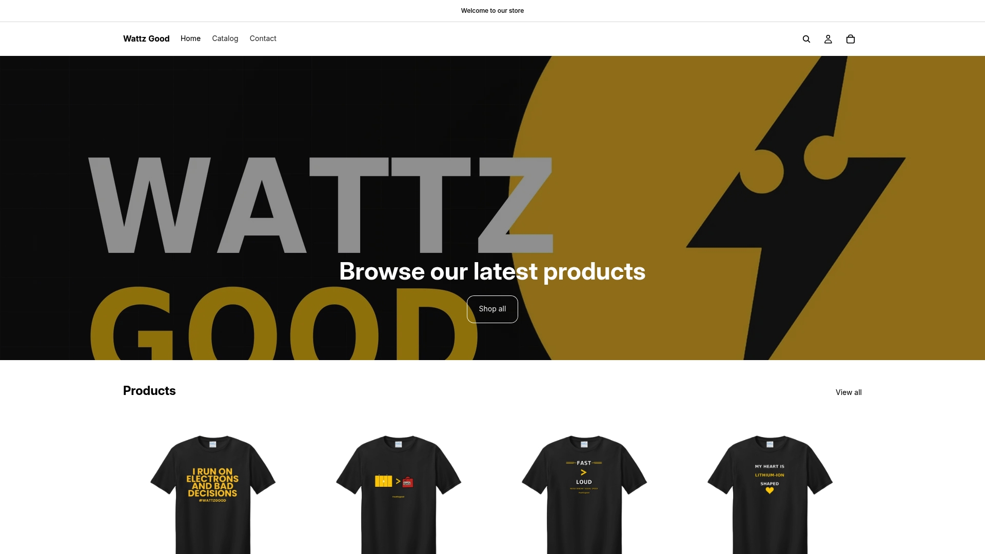
Our Wattz Logo Tee page shows the same transparent approach to materials and claims described above, and every product page links to our data-sharing opt-out so you know what information you’re sharing at checkout. Browse the full EV-themed lineup to find a design that fits your own message.
FAQ
What makes a good activist t-shirt slogan?
A good slogan is short, usually four to six words, and makes one clear point rather than several. Pairing it with a simple symbol, as seen in the Smithsonian’s “Silence = Death” shirt, helps the message register instantly in a crowd or photo.
Can I get in legal trouble for using a popular protest phrase?
Short phrases themselves are generally not protected by copyright, according to the U.S. Copyright Office, but original artwork, logos, and trademarked campaign names carry separate protections. It’s safest to write your own wording and run a quick trademark search before selling anything commercially.
Is it okay to call my shirt “eco-friendly” on the product page?
The FTC Green Guides advise against broad terms like “eco-friendly” without specifics, since they can create a misleading impression. State the actual attribute instead, such as the recycled content percentage or the fiber source.
What’s the best way to produce a small batch of protest shirts?
For small or uncertain quantities, print-on-demand avoids upfront inventory risk, while local screen printing becomes more cost-effective once you’re ordering several dozen units. Order a sample and a color proof before committing to a full run either way.
How do I make sure my shirt is readable from a distance?
Use bold sans-serif type, a high-contrast color pairing like black on white or black on yellow, and keep the front to one short message. Testing a printed mockup by photographing it from about fifteen feet away is a reliable way to catch legibility problems before a full print run.
Sources
- U.S. Copyright Office: Copyright basics / What does copyright protect?
- FTC Green Guides
- National Museum of American History: ‘Silence = Death’ t-shirt
- National Museum of African American History and Culture: ‘The World Is Not OK’ t-shirt